Product tour:
Cascadin

Project Type: UI writing for a product tour and competitive research.

About Cascadin: Cascadin is a small startup with no writers on staff. Their project management tool is geared toward small businesses or “teams of 5, not 500”. They’re thinking nonprofits, schools, and grandmas organizing rummage sales. As a consultant, I was asked to review the UI writing for their new product tour. They had no established voice and no style guide, and the strings were written by four different developers. The effect was an experience that vacillated between stilted and chummy.

Audience: New users

Activities: UI writing

Team: Cascadin co-founder and myself

My contribution: I wrote almost all strings on the “after” pages. My strings are marked with red arrows on the “After” screens. With their audience in mind, I recommended making the UI strings more personable and helpful and advocated for removing barriers in the user experience.

I based my recommendations on my product research, the voice I heard coming through in Cascadin’s marketing collateral and social media channels, competitor research, and conversations with the founders. Lacking user research or guiding voice principles, I relied on heuristics to inform my choices.

product tour thumb 2.jpg


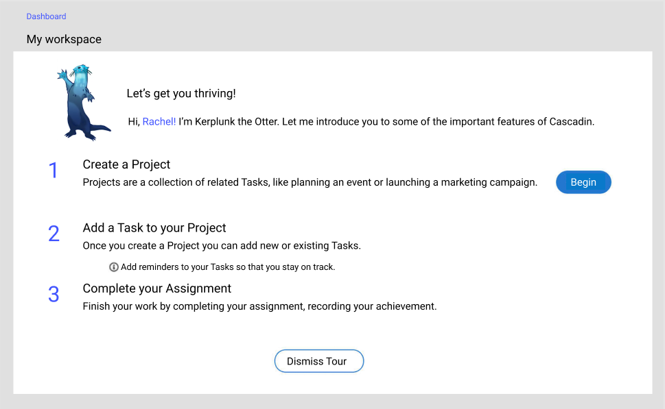
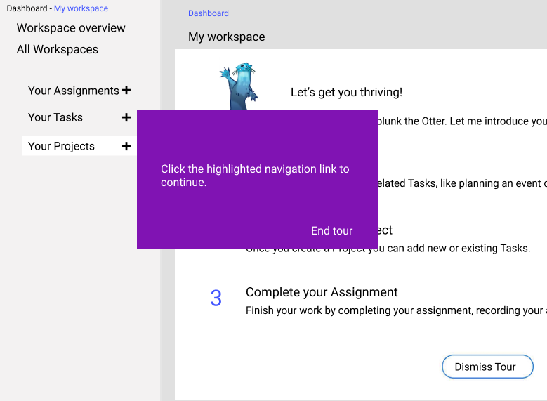
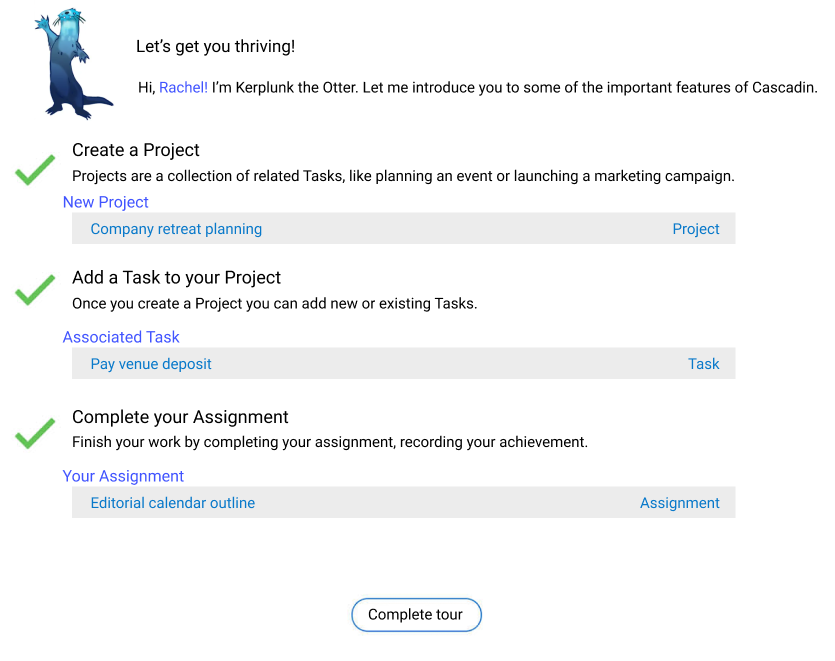
Product tour step 1: before


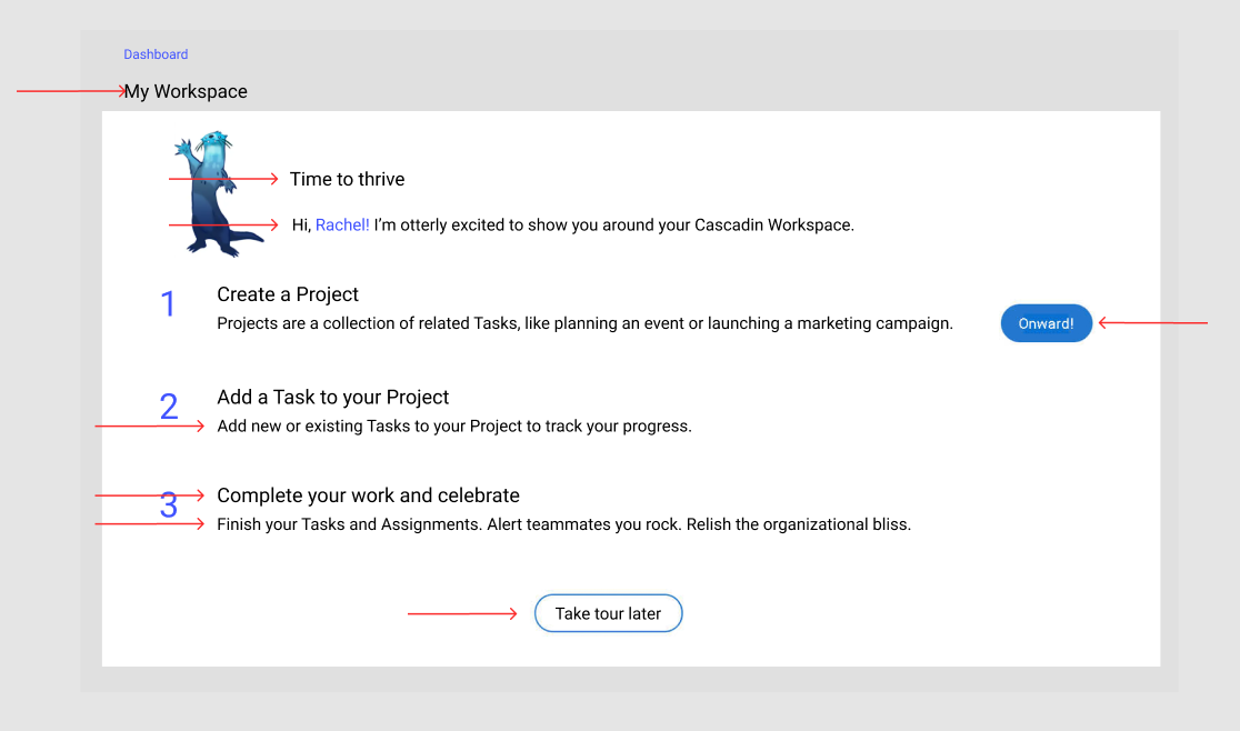
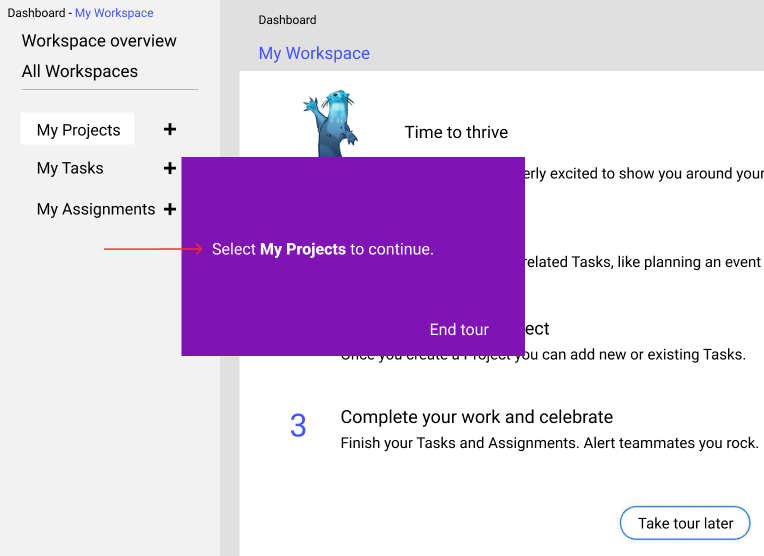
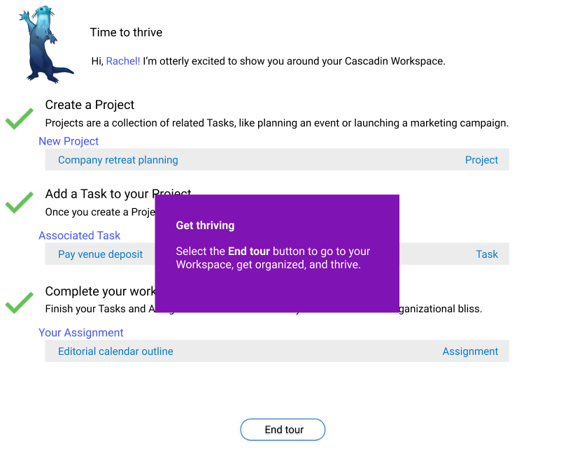
Product tour step 1: after

Change 1: Capitalized “W” in Workspace
*Capitalization was all over the place in the product. We agreed that all feature names would get capitalized for consistency.

Change 2: From “Let’s get you thriving!” to “Time to thrive”
*Shorter, more energetic.
*Removes implication the app is benevolently bestowing the ability to thrive upon the user.

Change 3: From “I’m Kerplunk…” to “I’m otterly…”
*The user was introduced to Kerplunk in a previous flow.
*Makes the experience about the user and their Workspace, not Cascadin.
*Silly pun makes the experience more fun—as long as it’s not overdone.

Change 4: From “Begin” to “Onward!” (right side of page)
*I advocated for no button here at all but was overruled.
*“Onward!” is used in Cascadin’s marketing emails and reflects the playful spirit of the product.

Change 5: Combined “add new tasks” with “tracking progress”
*Fewer words, same idea. Opens up the page.

Change 6: From “Complete your Assignment” to “Complete your work and celebrate”
*Completing work encompasses both Tasks and Assignments.
*Giving the user a pat on the back with “and celebrate”.

Change 7: From “Recording your achievement” to “Alert teammates you rock…”
*”Recording your achievement” is stuffy and not something a human person would say.
*Part of “recording your achievement,” as far as Assignments go, is alerting the Assignor it’s done. Hence the change to “alert teammates you rock”.
*“Relish” feels better than “recording an achievement” and gives the user a pat on the back.

Change 8: From “Dismiss tour” to “Take tour later”
*Dismiss is negative.
*”Take tour later” lets users know they can change their mind and come back to the tour.


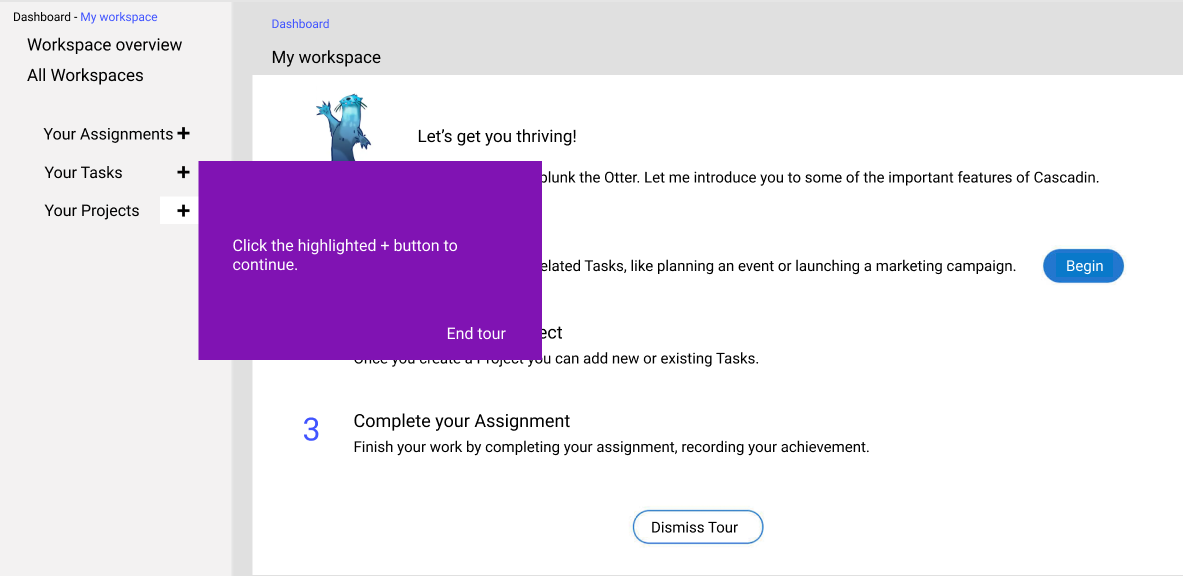
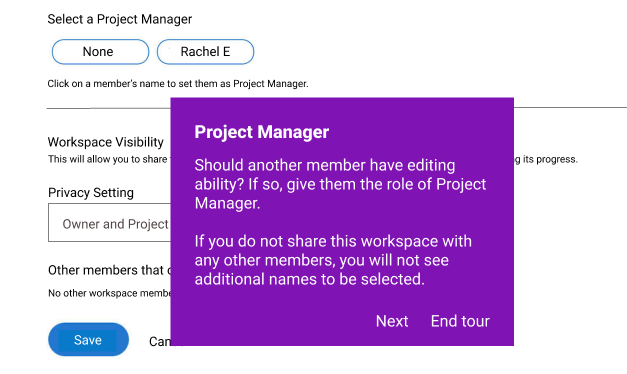
Product tour step 2: before


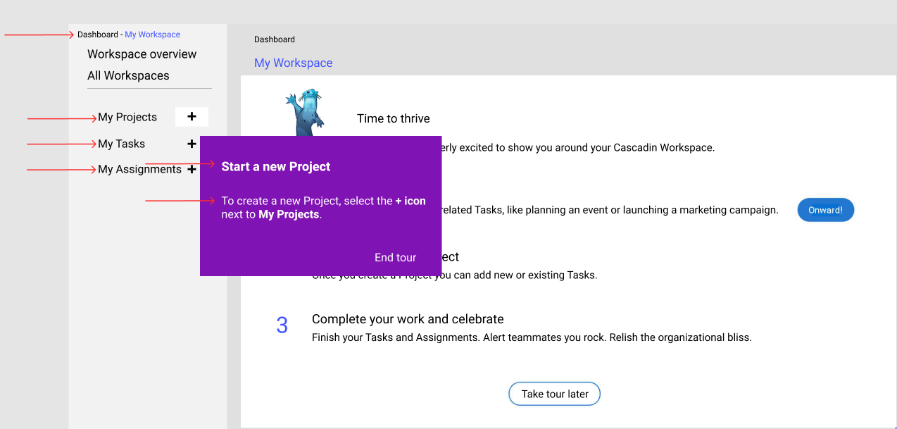
Product tour step 2: after

Change 1: Capitalized “W” in Workspace
*Keeping consistency in how feature names appear

Change 2: Flipped order of “Assignments,” “Tasks,” and “Projects”
*In the product, Projects are the parent so it makes sense to reflect that in the navigation and hierarchy.

Change 3: From “Your Projects” to “My Projects”
*More personal for the user.

Change 4: From “Click the highlighted…” to “Start a new Project”
*Letting the user know why they’re taking an action.

Change 5: From “click” to “select”
*Device agnostic.

Change 6: Additional explanation “select the + icon next to My Projects”
*More accessible and helpful.


Product tour step 3: before


Product tour step 3: after

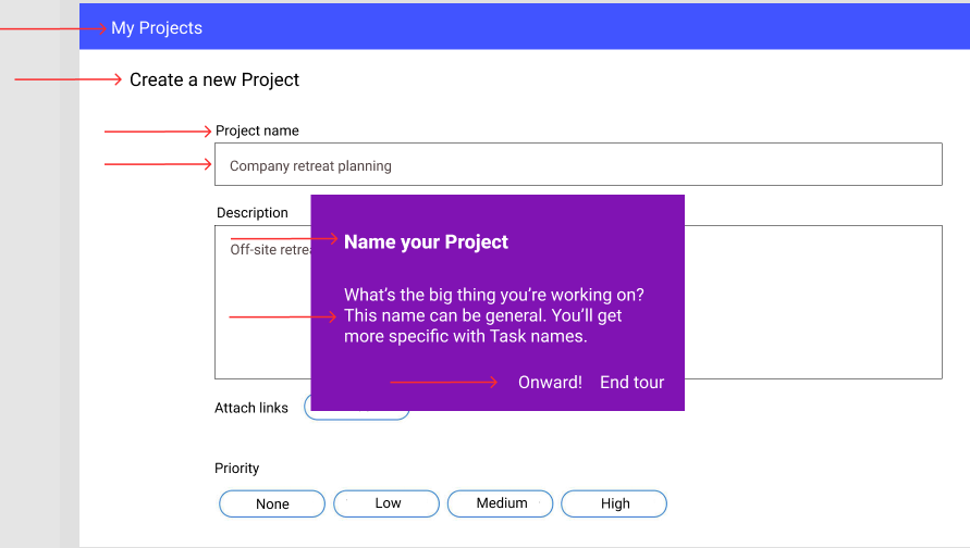
Change 1: From “PROJECT” to “My Projects”
*Friendlier and less shouty.

Change 2: Capitalized “P” in “Project”
*Keeping consistent with feature names.

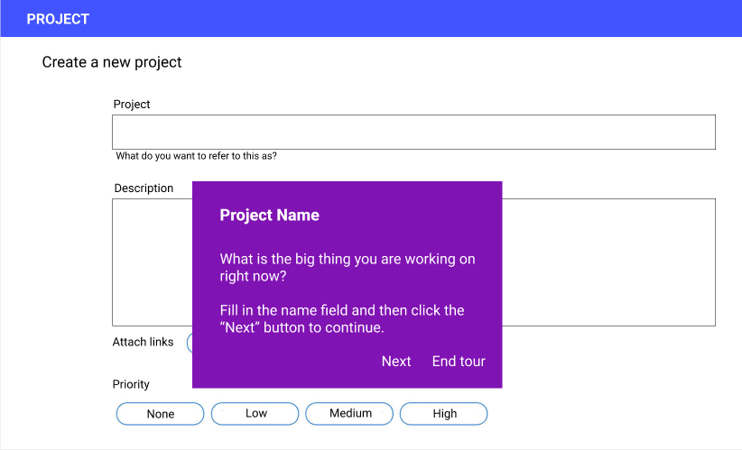
Change 3: From “Project” to “Project name” as the field label

*Adding “name” lets us remove the awkwardly worded string beneath the name field.

Change 4: Added helper text in the name field
*Driving home the point that the name can be general.

Change 5: Removed string under the Project Name field

*Clunkily worded and redundant.

Change 6: From “Project Name” to “Name your Project”
*A little more active.

Change 7: From “What is the…” to “What’s the…”
*Trying to talk like a human.

Change 8: Removed the “right now” from “What is the big thing you’re working on”.
*It’s unnecessary and may discourage users from using the tool for longer-term projects that aren’t being worked on “right now” in earnest but will get chipped away over time.

Change 9: From “Fill in the…” to “This name can be…”
*Giving just a little bit more info to help users along.

Change 10: From “Next” to “Onward”
*Experience continuity. I made this a universal change for “Continue” or “Next” buttons.


Product tour step 4: before


Product tour step 4: after

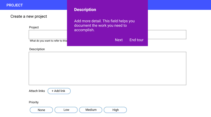
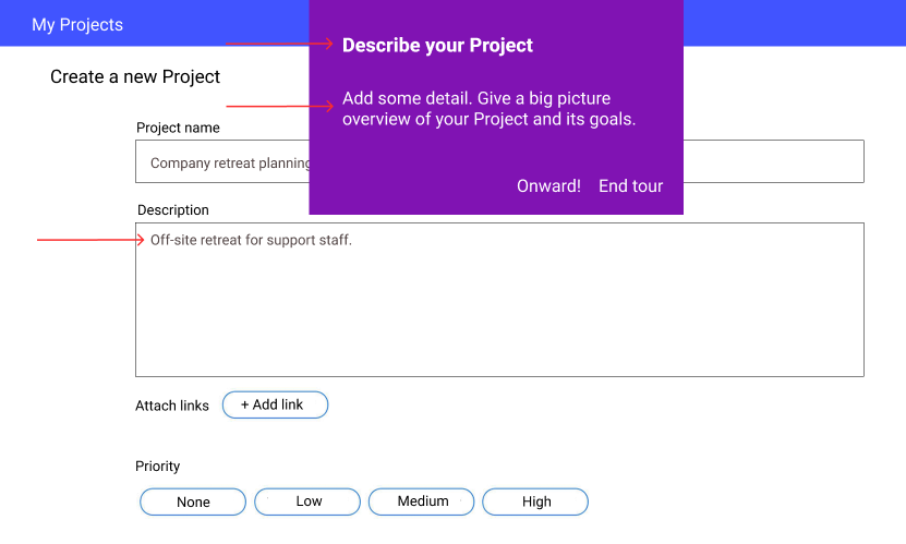
Change 1: From “Description” to “Describe your Project”
*More active.

Change 2: From “more detail” to “some detail”

*This is the first bit of detail that’s being added so “some” feels more accurate.

Change 3: From “This field helps you…” to “Give a big picture overview…”
*Moving from formal, complex language to simpler, more descriptive language.

Change 4: Added helper text in the description field
*A little help users.


Product tour step 5: before


Product tour step 5: after


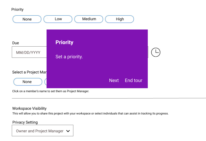
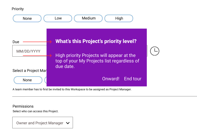
Change 1: From “Priority” to “What’s this Project’s priority level?”
*I know less is usually more, but I felt that just “Priority” sounded a bit gruff in its shortness. I decided to err on the side of being friendlier and really clear about what “priority” we’re talking about.

Change 2: Added detail to the body copy
*Adding useful information about what happens when a user designates a Project as high priorty.


Product tour step 6: before


Product tour step 6: after

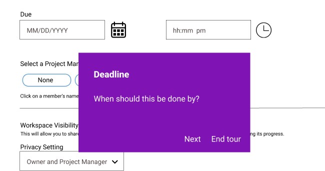
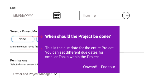
Change 1: From “Deadline” to “When should the Project be done?”
*Again, adding clarity, specificity, and a more conversational tone.

Change 2: Added context to the body copy
*Helping users understand how deadlines work within this product.


Product tour step 7: before


Product tour step 7: after

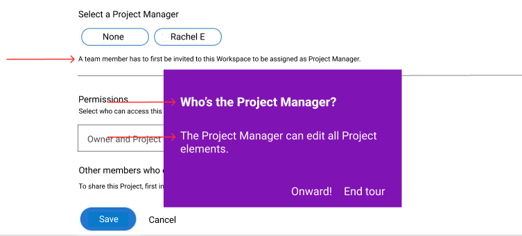
Change 1: Replaced “Click on a member’s name…” with “A team member has to first be…”
*It’s evident that a user should select a team member’s name to assign them as Project Manager. The more helpful information is that, if you’re not seeing a member’s name, you need to invite them to the Workspace.

Change 2: “Project Manager” to “Who’s the Project Manager”
*The full sentence helps complete the thought for the user and clue them in on what this field is asking.

Change 3: Changed “Should another member have…” to “The Project Manager can edit…”
*There may be edge cases where the Project Manager doesn’t want edit rights or where someone needs edit rights but doesn’t want to be named Project Manager. The original text felt limiting. It was a passive, roundabout way to tell users what the Project Manager role entails.

Change 4: “If you do not share…
*That string is covered by the string added in Change 1.


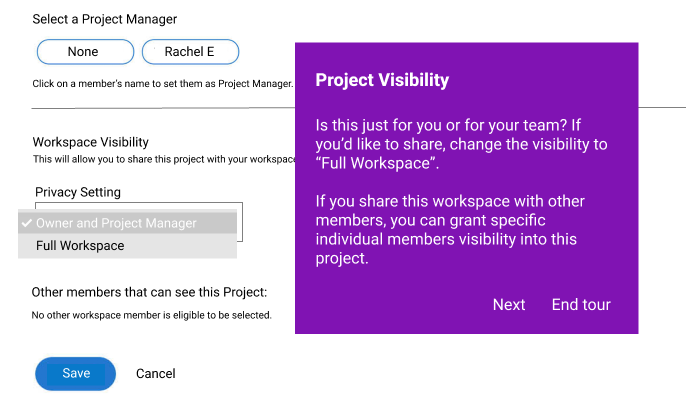
Product tour step 8: before


Product tour step 8: after

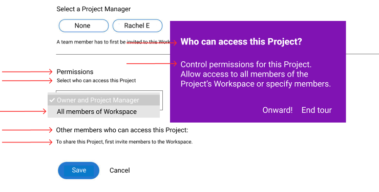
Change 1: From “Project Visibility” to “Who can access this Project?”
*Making the intention of this field clear.

Change 2: From “Is this project just for you…” to “Control permissions for…”
*The original copy described this feature in three different ways: 1) Workspace Visibility, 2) Privacy Setting, and 3) Sharing. I consolidated this to “Permissions” to give users a clear and recognizable term.

Change 3: From “Workspace visibility” to “Permissions”
*Again, lasering in on one name for this field. “Workspace Visibility” is vague and not intuitive.

Change 4: Added “Select who can access this Project”
*Helping users understand what permissions this field grants.

Change 5: Changed "Full Workspace” to “All Members of Workspace”
*”Full Workspace” is a confusing term for users who haven’t used the product yet. “All Members of Workspace” makes it clearer that visibility will be granted to actual people, not a theoretical Workspace.

Change 6: Changed “Other members that can see…” to “Other members who can access…”
*Access is more inclusive.

Change 7: From “No other workspace member is eligible…” to “To share this Project…”
*The original doesn’t give the user any information about why no members are eligible to see the Project. The edit alerts users that they need to add members to the Workspace to be able to share the Project.


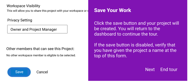
Product tour step 9: before


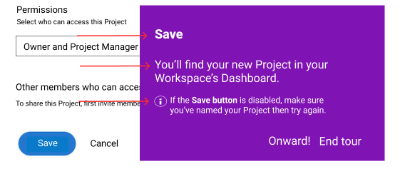
Product tour step 9: after

Change 1: From “Save Your Work” to “Save”
*More succinct, just as clear

Change 2: From “Click the save button and your project… ” to “You’ll find your new Project…”
*Fewer words, more information.

Change 3: Deleted “You will return to the dashboard”
*This didn’t feel necessary.

Change 4: “Verify that you have given…” to “make sure you’ve named…”
*More personable and active and less stuffy. Also, shorter.


Product tour step 10: before


Product tour step 10: after

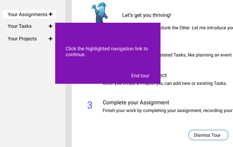
Change 1: From “Click the highlighted navigation link” to “Select My Projects”
*Clearer, simpler language.


Product tour step 11: before


Product tour step 11: after

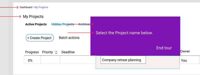
Changes 1 & 2: From “Your Projects” to “My Projects”
*Giving the user a bit more connection to and ownership of the experience.

Change 3: Deleted “Find your first Project”
*The direction to “find” felt unclear and at odds with the body string of “Click on”.

Change 4: From “Click on the linked name…” to “Select the Project name…”
*”Linked name” might be confusing for some users.


Product tour step 12: before


Product tour step 12: after

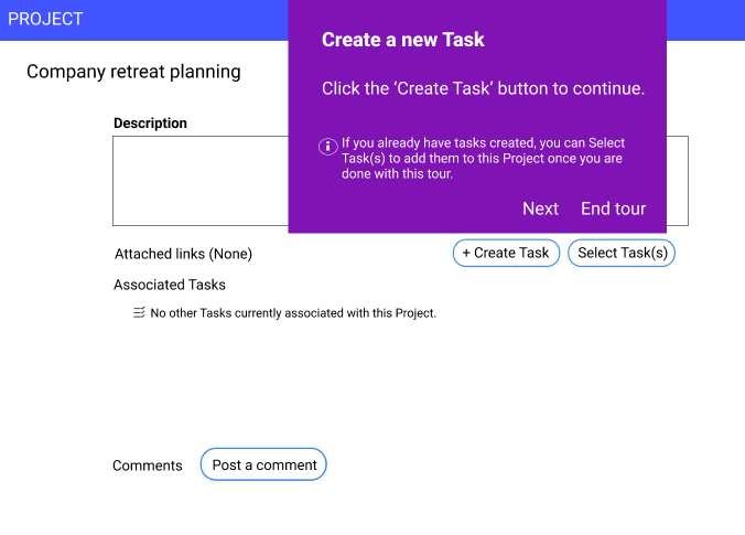
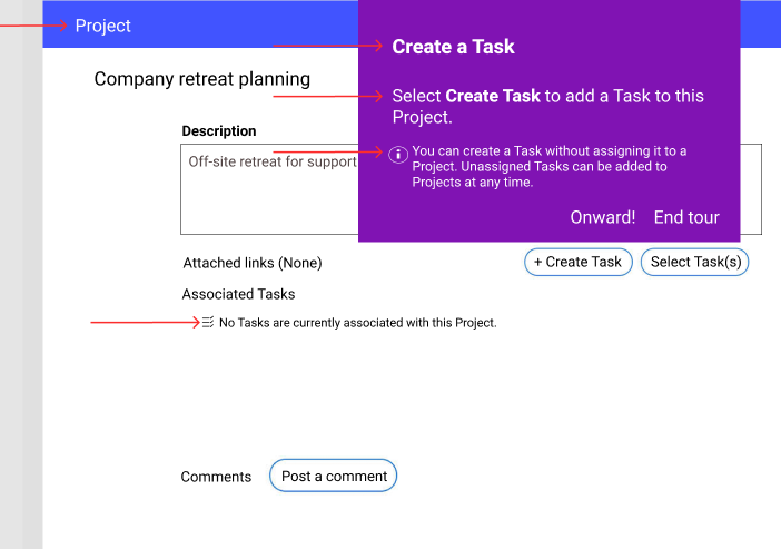
Change 1: From “PROJECT” to “Project”
*Less shouty.

Change 2: Removed “new” from “Create a new Task”
*Shorter, and the “new” isn’t necessary.

Change 3: From “Click the ‘Create Task’ button…” to “Select Create Task to add a Task…”
*The little bit of extra info makes the direction clearer.

Change 4: “If you already have tasks created…” to “You can create a Task…”
*The original wording doesn’t make it clear that unassigned Tasks can always be added to a Project later. Instead, it reads as though the user can only assign Tasks to a Project after the fact within the context of the product tour.

Change 5: “No other tasks…” to “No Tasks…”
*Just a slight rewording that makes the string a bit clearer.


Product tour step 13: before


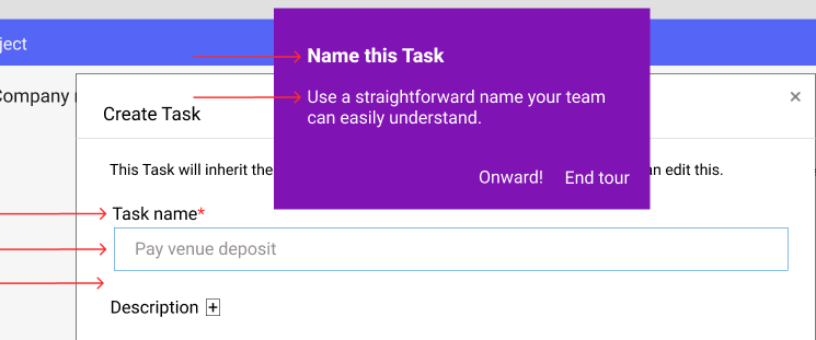
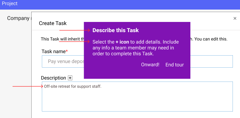
Product tour step 13: after

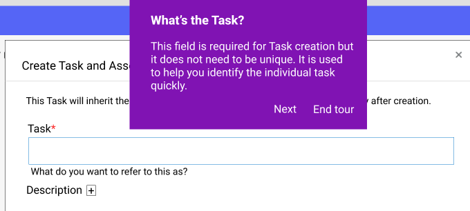
Change 1: From “What’s the task?” to “Name this Task”
*The original felt a little gruff.

Change 2: Removed “This field is required but…
*Users are savvy enough to know an asterisk means a field is required. If they aren’t, they’ll get an error message asking them to complete the field.
*Alerting users that names don’t need to be unique feels both unnecessary and confusing.

Change 3: Added “Name” to the field label
*Clearer and allows us to remove the string beneath the field.

Change 4: Added help text within the field
*Reinforces “straightforward naming” and removes the need for microcopy below.

Change 5: Deleted hint string beneath the name field
*The string was unnecessary and stilted in its wording.


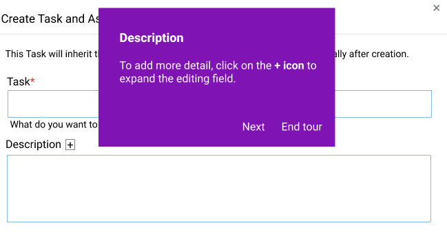
Product tour step 14: before


Product tour step 14: after

Change 1: From “Description” to “Describe this Task”
*The original was a bit gruff. The edit is more conversational and in line with other headings.

Change 2: From “To add more detail…” to “Select the + icon”
*Putting the action first and making the string more succinct.

Change 3: Added “Include any info…”
*Helping the user understand what type of information to provide.

Change 4: Added help text within the description field
*Helping the user understand what type of information to provide.


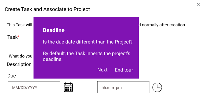
Product tour step 15: before


Product tour step 15: after

Change 1: From “Create Task and Associate to Project” to “Create Task”
*The original is confusing and clunky. It also contradicts the previous message that Tasks don’t automatically have to be associated with a Project.

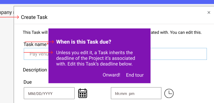
Change 2: From “Deadline” to “When is this Task due?”
*The full sentence is more conversational.

Change 3: From “Is the due date different than…?” to “Unless you edit it…”
*Changing the string from a question to a declarative statement helps the user more easily understand the action they need to take.


Product tour step 16: before


Product tour step 16: after

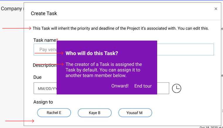
Change 1: From “This task will inherit the Project’s…” to “This Task will inherit the priority…”
*Clearer. It takes a few reads to grasp the original.

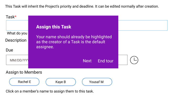
Change 2: From “Assign this Task” to “Who will do this Task?”
*The original feels a little bossy.

Change 3: From “Your name should already be…?” to “The creator of a Task…”

*Clearer and gives the user information about what action they can take.

Change 4: Removed “Click on a member’s name…”
*The info is redundant and awkwardly placed.


Product tour step 17: before


Product tour step 17: after

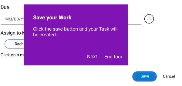
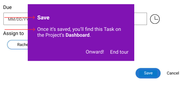
Change 1: From “Save your Work” to “Save”
*More succinct.

Change 2: From “Click the save button…” to “Once it’s saved…”
*Clearer and gives the user info on what happens next.
*“Your Task will be created” is passive and a bit confusing in the context.


Product tour step 18: before


Product tour step 18: after

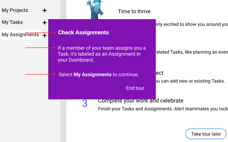
Change 1: Added “Check Assignments”
*Helping orient users to what’s happening in this step.

Change 2: Added explanation of Assignments

*This is the first time users are learning about Assignments, so a little explanation is relevant.

Change 3: From “Click the highlighted navigation link…” to “Select My Assignments…”
*Clearer and less jargon-y.


Product tour step 19: before


Product tour step 19: after

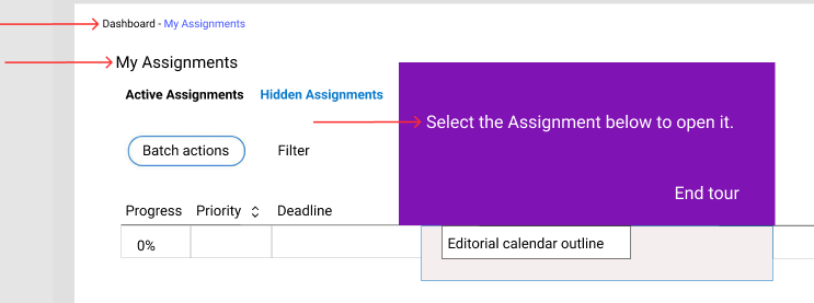
Changes 1 & 2: From “Your Assignments” to “My Assignments”
*Consistency and giving users more ownership over their experience.

Change 2: Removed “Find your Assignment”
*That directive felt a little confusing for users.

Change 3: From “Click on the linked name…” to “Select the Assignment below to open it”
*Clearer.


Product tour step 20: before


Product tour step 20: after

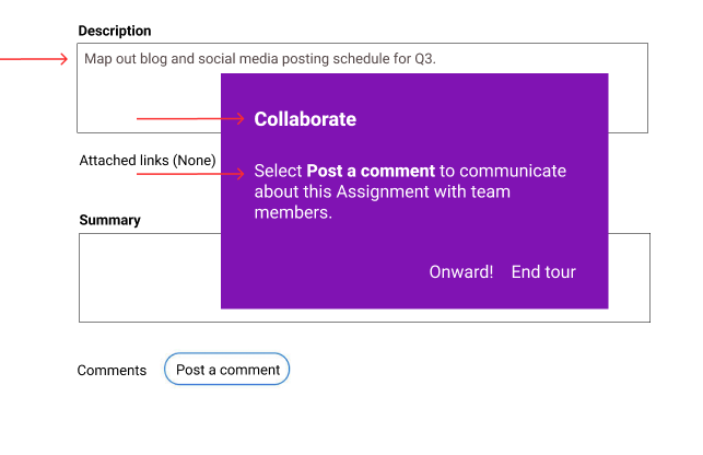
Change 1: Added hint text in the description field
*Helping users understand how broad the description can be.

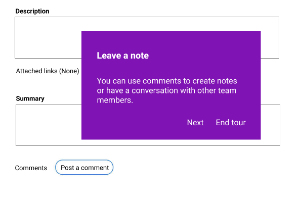
Change 2: From “Leave a note” to “Collaborate”
*The original is a bit vague. Collaborate more clearly communicates the intent of the field.

Change 3: From “You can use comments…” to “Select Post a comment…”
*The edit more clearly communicates the intent of the field and the action the user needs to take to use the field.


Product tour step 21: before


Product tour step 21: after

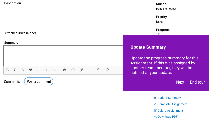
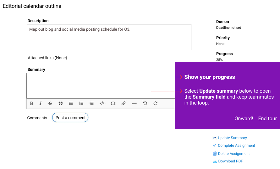
Change 1: From “Update Summary…” to “Share your progress…”
*As there is an “Update Summary” field, it’s unclear in this context if the original is a noun or verb. The edit eliminates confusion and makes clear the intent of the field.

Change 2: Changed “Update the progress summary for this assignment…” to “Select Update summary below…”
*Clearer and more succint.


Product tour step 22: before


Product tour step 22: after

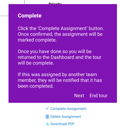
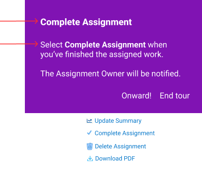
Change 1: From “Complete” to “Complete Assignment”
*Adding a little clarity for the user.

Change 2: Cut a lot of copy
*The original was wordy and gave more info than necessary. The edit gets to the point and is clearer.


Product tour step 23: before


Product tour step 23: after

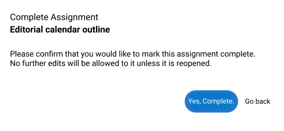
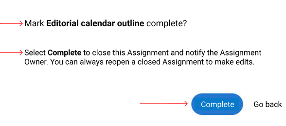
Change 1: From “Complete Assignment” to “Mark Editorial calendar outline complete?”
*The original isn’t quite as clear as it could be.

Change 2: From “Please confirm…” to “Select complete…”
*The original is redundant without offering new information. The edit clearly tells the user what will happen when they “Select Complete” while also easing any anxiety around prematurely closing an Assignment.


Product tour step 24: before


Product tour step 24: after

Change 1: Added a tip box
*Acknowledges the tour is complete.
*Orients the user to where they’ll land when they select “End tour”.
*Reminds the user of why they’re here - to thrive.

Previous
Previous

Financial well-being app explainer

Next
Next

SaaS user sign up