New user sign-up flow:
Cascadin

Project Type: UX writing for a new user sign-up flow.

About Cascadin: Cascadin is a small startup with no writers on staff. Their project management tool is geared toward small businesses or “teams of 5, not 500”. They’re thinking nonprofits, schools, and grandmas organizing rummage sales. As a consultant, I was asked to review the UI writing for their new product tour. They had no established voice and no style guide, and the strings were written by four different developers. The effect was an experience that vacillated between stilted and chummy.

Audience: Prospective and new users.

Activities: UX writing, competitor research, voice and tone chart.

Timeline: One week.

Team: Cascadin co-founder and myself.

My contribution: I wrote all strings on the “after” pages. I recommended making the UI text more personable and helpful and removing barriers in the user experience. I based my recommendations on my product research, Cascadin’s marketing collateral and social media channels, competitor research, and conversations with the founders. Lacking user research or guiding voice principles, I relied on heuristics to inform a lot of my choices.

Screen Shot 2020-10-15 at 8.44.56 PM.png

Sign-up step 1: before

1a. Sign up step 1.jpg


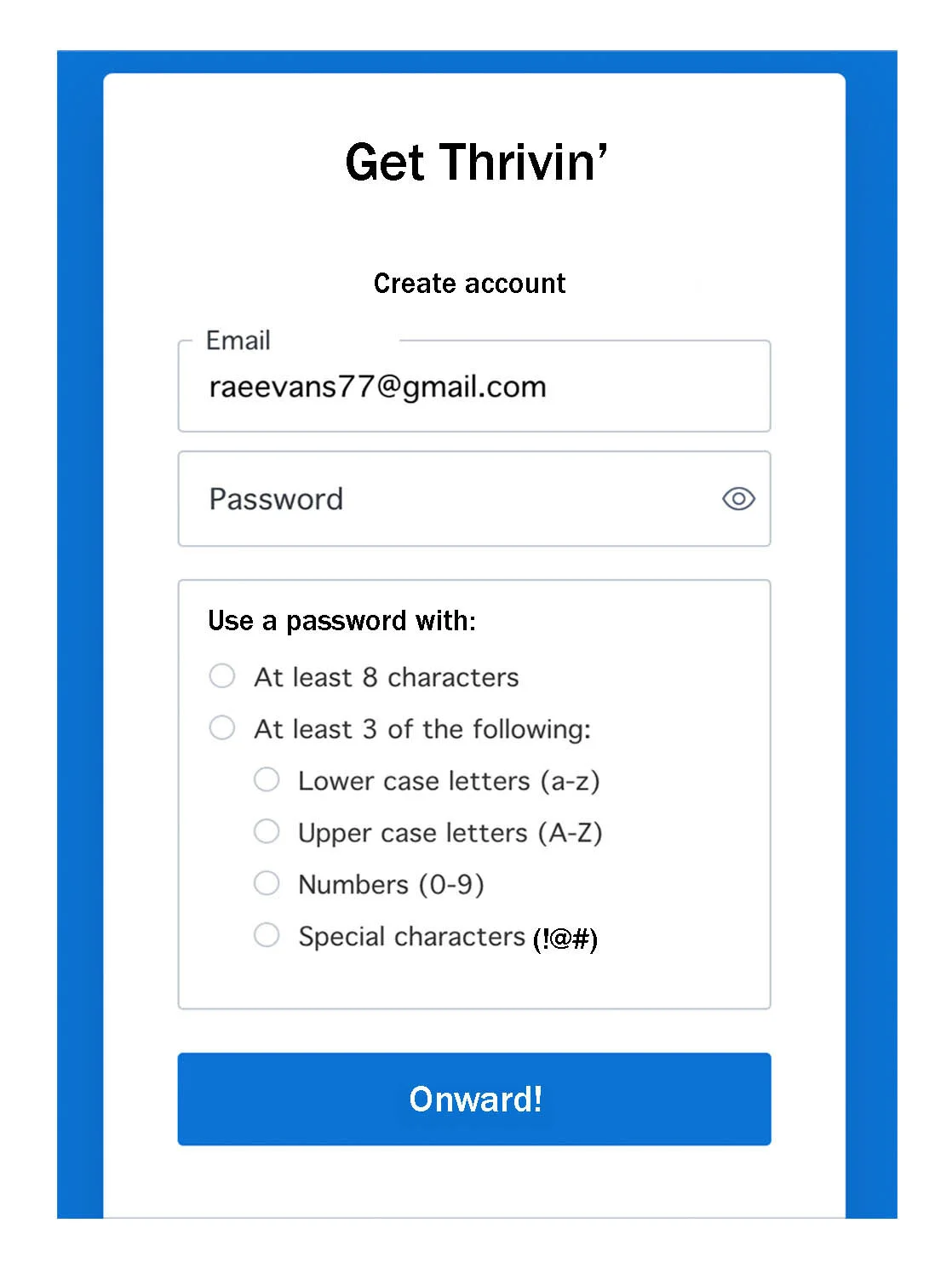
Sign-up step 1: after

1b. Sign up step 1.jpg

Change 1: From “Sign Up” to “Get Thrivin’”
*Reflects Cascadin’s main marketing tagline of “organize to thrive”.

*Reflects the product’s ease of use: it’s so simple, users create an account and are up and thriving.

*Adds energetic momentum around creating an account. Taking time to sign up won’t break a user’s stride.

*Infuses brand personality while simultaneously cutting the first two lines of copy in half.

Change 2: From “Email address” to “Email”
*Address is unnecessary - adiós!

Change 3: From “Continue” to “Onward!”
*Creates continuity of experience by reflecting Cascadin’s use of “Onward” in their email sign-offs.

*Infuses energy into the experience, reflecting Cascadin’s goal of helping users thrive.

*Gives the same directive but with a bit of personality.

Change 4: From “Already have an account?” to “Have an account?”
*Why use four words when three will do?

Change 5: From “Log In” to “Welcome Back”
*“Welcome back” creates a more personable and inviting experience.

Sign-up step 2: before

2a. Sign up step 2.jpg


Sign-up step 2: after

2b. Sign up step 2.jpg

Change 1: From “Your password must contain” to “Use a password with”
*A friendlier approach to the same information.

Change 2: After “special characters” the “(ex. !@#)” changed to “(!@#)”
*The “ex” trips the eye up a bit. Minor, but it could take users out of the experience.


Sign-up step 3: before

C_Sign up_4.png


Sign-up step 3: after

3b. Sign up step 3.jpg

Change 1: Changed descriptive copy
*Infusing a little bit of lightheartedness into a boring yet necessary screen.

*Cut the redundancy of “terms and conditions” and “privacy policy” from three uses to two.


Sign-up step 4: before

C_Sign up_6.png


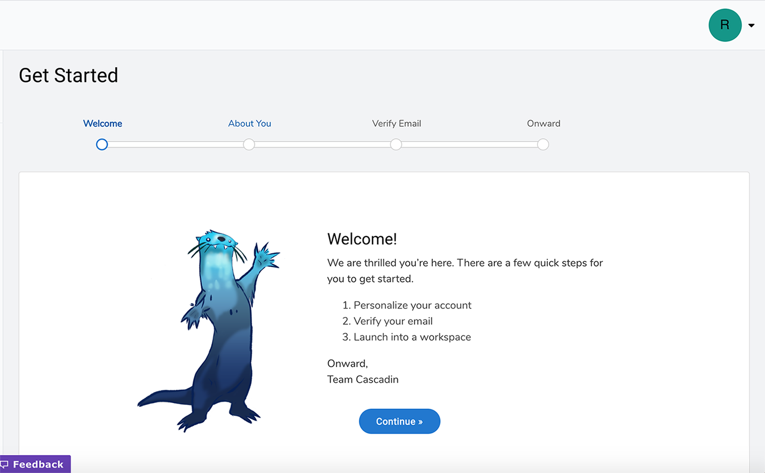
Sign-up step 4: after

4b. Sign up step 4 final.jpg

Change 1: Deleted “We are thrilled”
*Nixing language that’s simultaneously formal, effusive, and unnecessary.

Change 2: Shortened “There are a few quick steps…” to “Just a few quick steps to go”
*Again, nixing the formality and cutting 11 words to 7.

Change 3: Deleted “Onward” from the sign off
*Reducing redundancy of using “onward” for both the sign-off and the button label.

Change 4: From “Team Cascadin” to “Kerplunk the Otter”
*“Team Cascadin” is mentioned only rarely across the entirety of Cascadin’s communications and the product UI. As soon as users move into the product and product tour, they meet Kerplunk. Nixing “Team Cascadin” for “Kerplunk” preserves the continuity of user experience and is easier on users, who shouldn’t be asked to identify with multiple names/entities.

Change 5: Added “Team Cascadin’s friendly mascot”
*Assigning Kerplunk a personality attribute (friendly) to help ease any user anxiety around learning a new product.


Sign-up step 5: before

C_Sign up_7.png


Sign-up step 5: after

5b. Sign up step 5.jpg

Change 1: From “Account Profile” to “Profile”
*There isn’t a ton of “personalizing” going on on this page, so removing “Account” helps users feel like this really is their profile, not their account’s.

Change 2: From “Help us personalize…” to “Personalize your account”
*The tool should do the lifting, not ask the user to help lift.

Change 3: From “Nickname” to “Username”
*Nickname has potential to be emotionally loaded. Switching to Username avoids surfacing any bad third-grade memories.

Change 4: From “What name may we call you?” to “How Kerplunk will greet you”
*Did we just bestride a stagecoach? This much formality is dizzying.

*Posing this as a question makes the user stop and think, “Huh, what name am I ok with a software provider calling me?”

*Clearer and keeps the transaction short.

Change 5: From “Give us every name you’ve ever been called since birth” to “two’s fine”
*Workplace protocol and user comfort should decide whether users go by full name or first name only.

Change 6: From “Your displayed name in your workspace” to “Name you want other users to see”
*At this point a user isn’t sure what their workspace is and whether it’s private or public. The new copy makes clear users should anticipate others viewing this name.

Change 7: From “Optional Profile Photo” to “Profile Photo (Optional)”
*
Some users will see the word optional and stop reading there. The change shows users what the field is before telling them it’s optional.


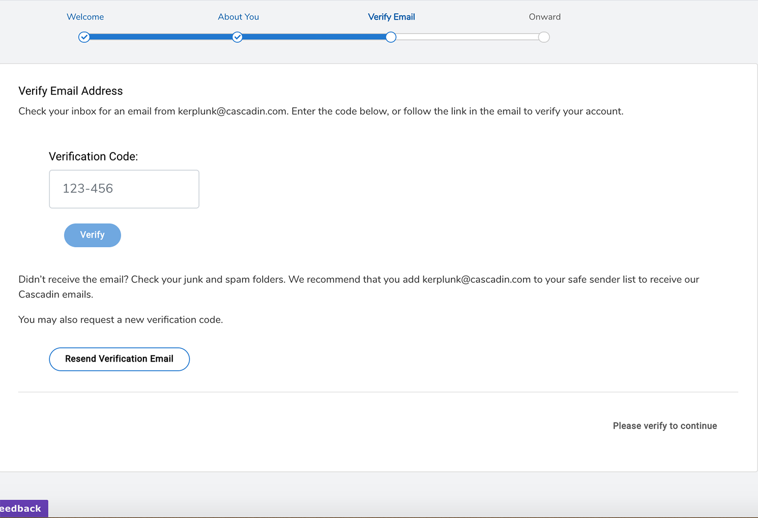
Sign-up step 6: before

C_Sign up_9.png


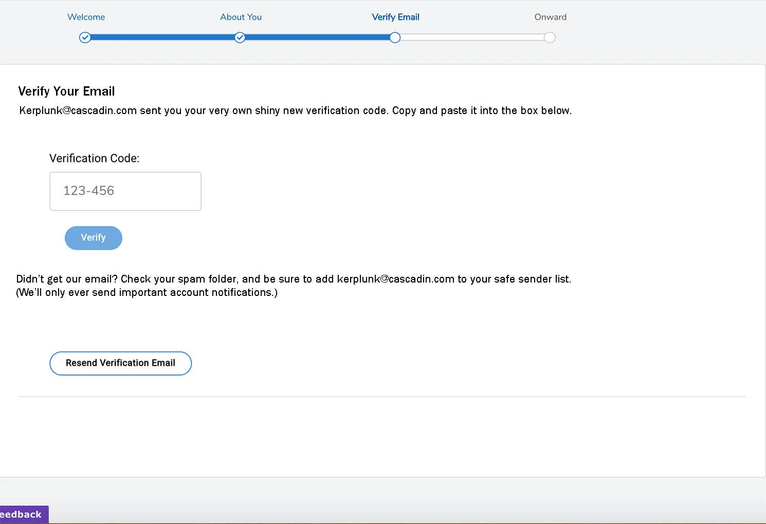
Sign-up step 6: after

6b. Sign up step 6.jpg

Change 1: From “Verify Email Address” to “Verify Email”
*Address is unnecessary.

Change 2: From “Check your email for….” to “Kerplunk@cascadin.com sent you…”
*Infusing the tiniest bit of fun into an otherwise boring, yet necessary, step.

Change 3: Deleted “or follow the link in the email to verify your account”
*Don’t follow that link, bruh! It leads down a very frustrating path of being sent back to the beginning of the sign-up process. The user has to re-enter their information - including all four of their names - and has to go through the verify email process again. Users end up just having to copy and paste the code regardless.

Change 4: From “Didn’t receive…?” to “Didn’t get…?”
*Receive is a little formal and uses two syllables where one will do.

Change 5: Cut “junk and spam” to “spam”
*Redundant.

Change 6: From “We recommend…” to “Be sure to…”
*From formal and passive to directive and actionable.

Change 7: Deleted “to receive our Cascadin emails”
*Users are savvy and know why they’d want to add an address to a safe sender list.

Change 8: Added “(We’ll only ever send important account notifications.)”
*Easing user anxiety around allowing emails from Cascadin.

Change 9: Deleted “you may also request a new verification code”
*The button already gives this information.

Change 10: Removed “please verify to continue” from the bottom right corner of the screen
*Not sure what it’s doing there, and it’s not needed. Everyone at the party’s desperately trying not to make eye contact with it, so let’s just send it home.


Sign-up step 7: before

C_Sign up_10.png


Sign-up step 7: after

7b_Sign up step 7.jpg

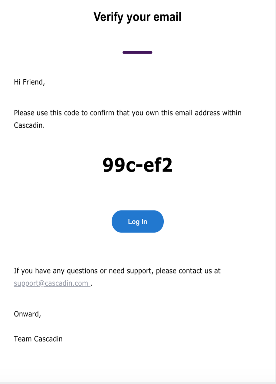
Change 1: From “Friend” to user’s name
*The user was asked to input their name like five times to “personalize” their account. The tool should reward the user’s efforts by using their name.

Change 2: From “Please use this…” to “You’re soooo close…”

*Switching from overly polite to personable to infuse the experience with energy and let the user know they’re almost at the end of the process.

*”Confirm that you own this email address within Cascadin” is clunky and confusing.

Change 3: Deleted Log In Button
*It leads back to the beginning of the sign-up process creating a frustrating user experience. Sisyphus is rolling that boulder faster than you’re signing up through that link.

Change 4: From “If you have any questions…” to “Questions? Need support?…”
*Less formal, fewer words, same info gets the user through the experience quicker.

Change 5: Added exclamation mark to “Onward”
*Infusing energy into the process because this user is going to conquer the world by using Cascadin.

Change 6: “Team Cascadin” to “Kerplunk”
*Keeping the persona consistent to help the user.


Sign-up step 8: before

C_Sign up_11.png


Sign-up step 8: after

8b. Sign up step 8.jpg

Change 1: From “Verify Email Address” to “Verify Email”
*Address is unnecessary - Auf Wiedersehen!

Change 2: Removed “We don’t want you to miss…”
*The user was asked to add Cascadin to their safe sender list in a previous step, so this is redundant.

Change 3: Added: “You’re good to go! You’re almost ready...”
*Removing “We don’t want you to miss…” freed up real estate. Seems like a good time to reassure the user they’re thisclose to being done signing up and getting on with the business of getting organized.


Sign-up step 9: before

C_Sign up_12.png


Sign-up step 9: after

9b. Sign up step 9.jpg

Change 1: From “This is how you will identify…” to “This name is public…”
*It seems self-evident that a user will identify something by how they name it. Letting users know whether this name will be visible to others seems like a bigger need.

Change 2: From “May” to “can”
*Continuing with being less formal and more personable.

Change 3: From “Begin Trial” to “Begin Thriving”
*Reducing the redundancy of language between “start your free trial” and “begin trial”. Also infusing the brand into the experience.

 
Previous
Previous

SaaS product tour

Next
Next
Request for information flow